Pop Off : 7 Mistakes to Avoid with Website Popups
Posted on
Just don’t! You know the feeling, you are in the middle of reading a webpage and then BANG! A great big popup appears in front of your face. The worst ones are the ones that ZOOM-IN and then JIGGLE. Save the planet people. Don’t popup.
If you really must use a popup, here are some tips for not annoying your readers:
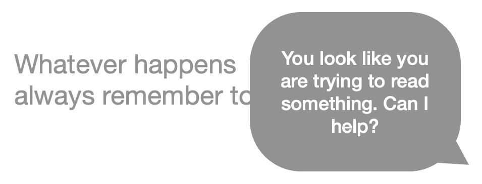
Avoid Covering Text
Allow the reader to continue to read the main body of text without having to close the popup.
Avoid Fixed Position
Avoid making the popup scroll with the page. Allow the user to scroll away from the popup.
Imagine that this is some really interesting text that you want to read on this website without being distracted. You can scroll this box. Go ahead and try. You will notice that as you scroll, the popup does not scroll away. It stays where it is. Always in the way. It follows you. You can never escape! It will always be there. A constant reminder of how much you hate popups.
Make it Small
Narrow popups at the top of the page can look quite good. The smaller it is, the less annoying it will be for your readers.
Don’t be Fancy
I remember the days when Microsoft PowerPoint introduced a bunch of “really cool” transitions, and we all thought our bosses would be impressed by how flashy our business presentations looked. They weren’t. It just looked tacky.
Avoid making your website look like a 90s PowerPoint presentation. Don’t zoom, Don’t wiggle, Don’t jiggle, Don’t move, Don’t talk out-a time, Don’t think, Don’t worry, Everything’s just fine, Just fine (That goes for U2).
Use Appropriate Colours
Not bright red, unless it is an emergency. Think about how the design of your popup suits the design of the rest of the website.
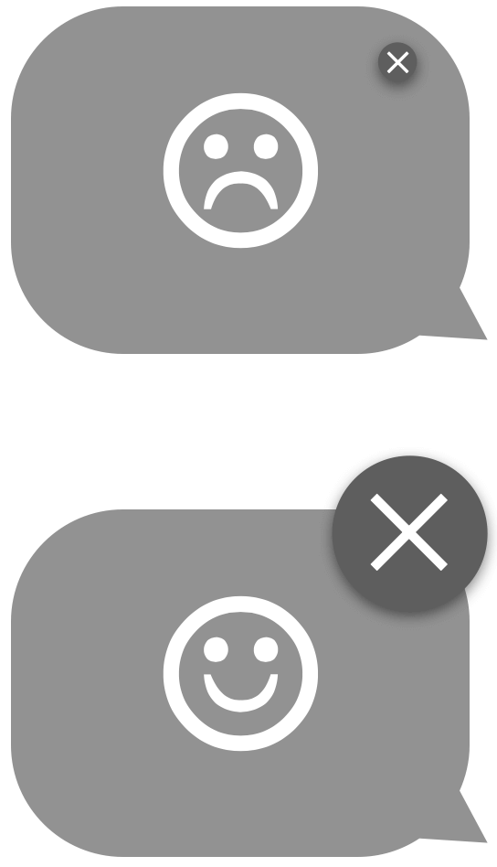
Close Me
Allow the reader to close the popup easily. The best method is to close it when the reader clicks anywhere on the pop up.
If clicking the popup is designed to link to another page, then make it close when the reader clicks anywhere outside the popup. Alternatively, make the close button large so it is easy to click.
Be Responsive
Test your popup on small devices to ensure it still follows all the guidelines.
Conclusion
With a little thought, popups can serve their purpose without getting in the way too much. Leave a comment and share the most hideous popup you have seen and what website you found it on.
Would you like to see more posts like this? I was thinking of doing a survey of website popups and ranking the best/worst ones that I find. Also, what about a competition for who can create the most annoying popup? Who’s in?
Leave a Comment